Destination BC
Giving the Wild a Voice
— where it began
The province hadn’t change.But the story we told about it did.
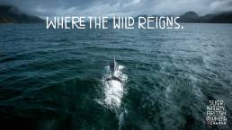
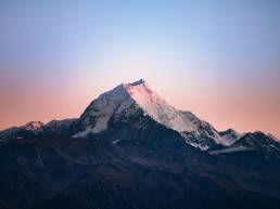
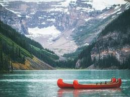
British Columbia (BC) is one of the few places left where wilderness still dominates the horizon. Thunderous waves, old-growth rainforests, peaks that make you feel genuinely small, this is a place that changes people. A landscape that doesn't need embellishment, it needs a brand that can carry its weight.
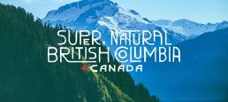
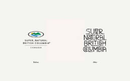
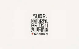
That gap between what BC is and what its brand was communicating was the real brief. The tagline Super, Natural British Columbia had been there for years. Familiar enough to ignore. The words still held truth. The feeling behind them had gone quiet.
The work wasn't about reinvention. It was about reconnection. About building a visual system strong enough to hold the actual experience of the province and returning the tagline to the center, as an organizing principle rather than a line of copy.
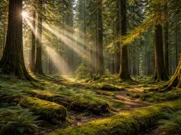
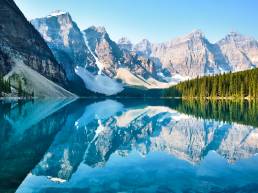
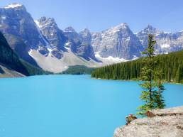
evergreen forest rising toward snow-capped peaks, british columbia.
— the insight
BC doesn’t just give you an experience.It gives your perspective.
We started by asking what people actually bring home from time spent here. Not the photographs or the itinerary, but the feeling. The quiet of the mountains. The endless coastline. The sense of standing somewhere that exists entirely on its own terms.
That realization shaped the work. The brand moved away from describing activities and toward capturing the emotional shift that happens when you’re there. Because what people carry home from British Columbia isn’t just memories of a place, it’s perspective.
“The brand didn't need to sell British Columbia.It was to make you feel it before you even arrived.”
— what we were up against
01
A Place on the World Stage
British Columbia sits alongside some of the most extraordinary destinations in the world. But the brand didn’t reflect that. The goal was to give BC an identity that matched the power of the place itself, something distinctive, memorable, and confident enough to stand alongside the world’s great travel brands.
02
One Province, Many Landscapes
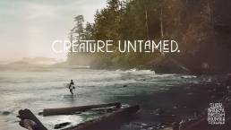
British Columbia isn’t defined by a single landscape. It’s rugged coastline, temperate rainforest, alpine mountains, interior grasslands, lakes, islands, and deep fjords. The system had to hold all of it together without making any of it feel the same.
03
Honest, Not Perfect
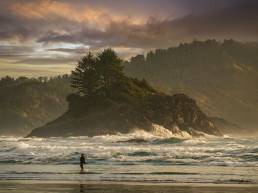
Tourism advertising often tries to make places look perfect. British Columbia doesn’t need that. Its power comes from being real, vast, rugged, and sometimes unpredictable. The identity needed to reflect that honesty without losing the character that makes BC what it is.
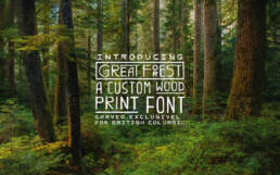
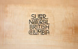
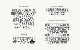
the great forest custom typography
— typography
Every brand needs a voice. For BC, that voice needed to feel like it came from the land itself, not from a design studio.
Great Forest is a custom display typeface created specifically for Destination BC. The brief was simple and hard in equal measure: make something that feels like it belongs here. Not a font that sits politely on a page but one that looks like it was left there, the way initials get carved into a trailhead post or a piece of driftwood on the shore. Something human. Something imperfect. Something that could only be BC.
— the colour palette
The landscape already had a palette.We simply used it.
If you’ve spent time in British Columbia, these colours probably feel familiar.
The deep green of old-growth forests. The blue of glacial water. The gold of late afternoon light on cedar.
Rather than inventing a palette, we simply looked to the landscape. When the colours come from the place itself, they tend to work together naturally.
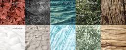
the colours of british columbia - forests, lakes, stone, ocean, snow and lichen.
— my contribution
Why British Columbia feels different
Before any design begins, the place itself has to be understood. For British Columbia, that meant looking beyond what the province looks like and paying attention to how it feels to be there.
The scale of the mountains. The quiet of the forests. The way the coastline stretches further than expected. The sense that the landscape operates on its own terms.
Those qualities became the foundation for the work.
My role focused on the research, art direction and the visual exploration phase. The stage that shapes the direction of the identity before any formal design begins.
Research & Exploration
01
Landscape Research
Looking closely at the province itself, its landscapes, textures, and regional character.
02
Typography Exploration
Exploring type that felt grounded and crafted, not overly polished or generic.
03
Colour Studies
Pulling colours directly from real environments across British Columbia.
04
Colour Studies
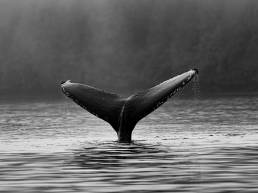
Helping shape a photographic style that felt honest, raw and documentary.
05
Photographic Direction
Helping shape a photographic style that felt honest, raw and documentary.
06
Identity System Exploration
Exploring how one identity could work across a province this geographically diverse.