Destination BC
Born of the wild.
Martha Stewart
Elevate your taste.
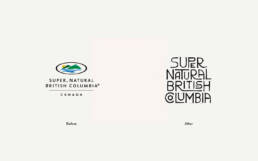
When Tourism British Columbia became Destination BC, it was more than a name change. It was a rediscovery of what the province truly stands for.
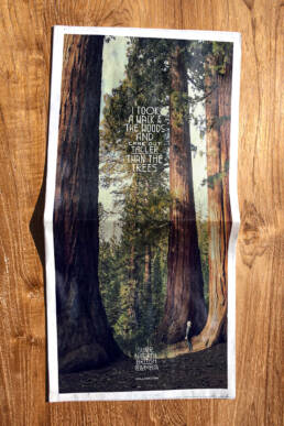
A place where ocean mist rolls through ancient forests, where the land feels alive, and where nature is not a backdrop but the main character.
The new brand needed to express that feeling. The sense of awe that takes over when you stand in the middle of British Columbia’s wilderness and realize how small you are, yet how connected you feel. That emotion became the foundation for the rebrand.

The Challenge
Tourism BC’s old identity no longer reflected the spirit of the province or the way people experienced it. The challenge was to create a brand that spoke to the heart as much as the map. It needed to feel handcrafted, natural, and true to every corner of British Columbia, while remaining flexible enough for the many regional partners who would use it.
The Answer
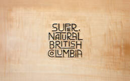
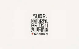
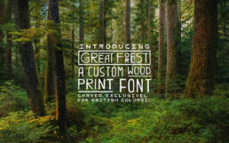
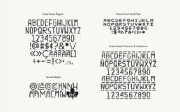
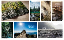
The result was a bold, tactile identity that feels carved from the land itself. At its core is Great Forest, a custom hand-carved wood typeface designed to be organic, imperfect, and human. Each letter carries the marks of traditional carving tools, with spacing based on the width of the blade. This allows the type to stack vertically, echoing the structure of British Columbia’s totem poles.
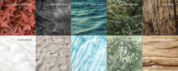
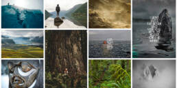
The new identity was supported by an authentic photographic system. Ten local photographers captured BC’s landscapes in natural light, celebrating the province’s raw beauty without filters or retouching. Together, these elements gave new life to the iconic tagline: “Super, Natural British Columbia.”

Agency
Camp Pacific
Year
2014
Recognition
Brand New: Best Global IdentitiesMarketing AwardsApplied ArtsLotus AwardsWebby AwardsOne Show (shortlist)Cannes Lions (finalist)
Role
As an Art Director, I worked alongside the team at Camp Pacific to help redefine the Destination BC brand. My focus was on bringing the spirit of British Columbia to life through design and imagery. I developed moodboards, directed typography and photography explorations, and collaborated with other Art Directors and Copywriters to shape the brand’s visual tone. Every creative decision was rooted in authenticity, ensuring the new identity felt as alive and untamed as the province itself.
Credits
ēthos
Identity, Type Design
Catherine Piercy
Brand Strategy
Pia Redway
Project Manager
Michelle Man
Account Services
David Giovando
ACD, sr. Copywriter
Todd Takahashi
ACD, sr. Art Director
Jake Gauthier
Art Director
Greg Kieltyka
Copywriter